
Back to Work
Product Design
UX research
Prototyping
User testing
Product Design
UX Research
Design System Improvements
Improving states of Design System components to respond to user feedback.
Timeline
1 sprint (2024)
Role
Product Designer
Contribution
To respond to user feedback, I reworked systematic solution for semantic and disabled states of the internal Design System

Discovery
The ingestion process is complex and composed of multiple potential flows. The most important one is the setup. The product is very "setup" heavy, as it is critical to setup all the data sources properly first for the good function of the product. There are also different levels of complexity and requirements for each different system integration, and all these cases and options need to be carefully considered to create a solution that lets the user setup any kind of configuration easily, while taking into account all those different setup complexities.
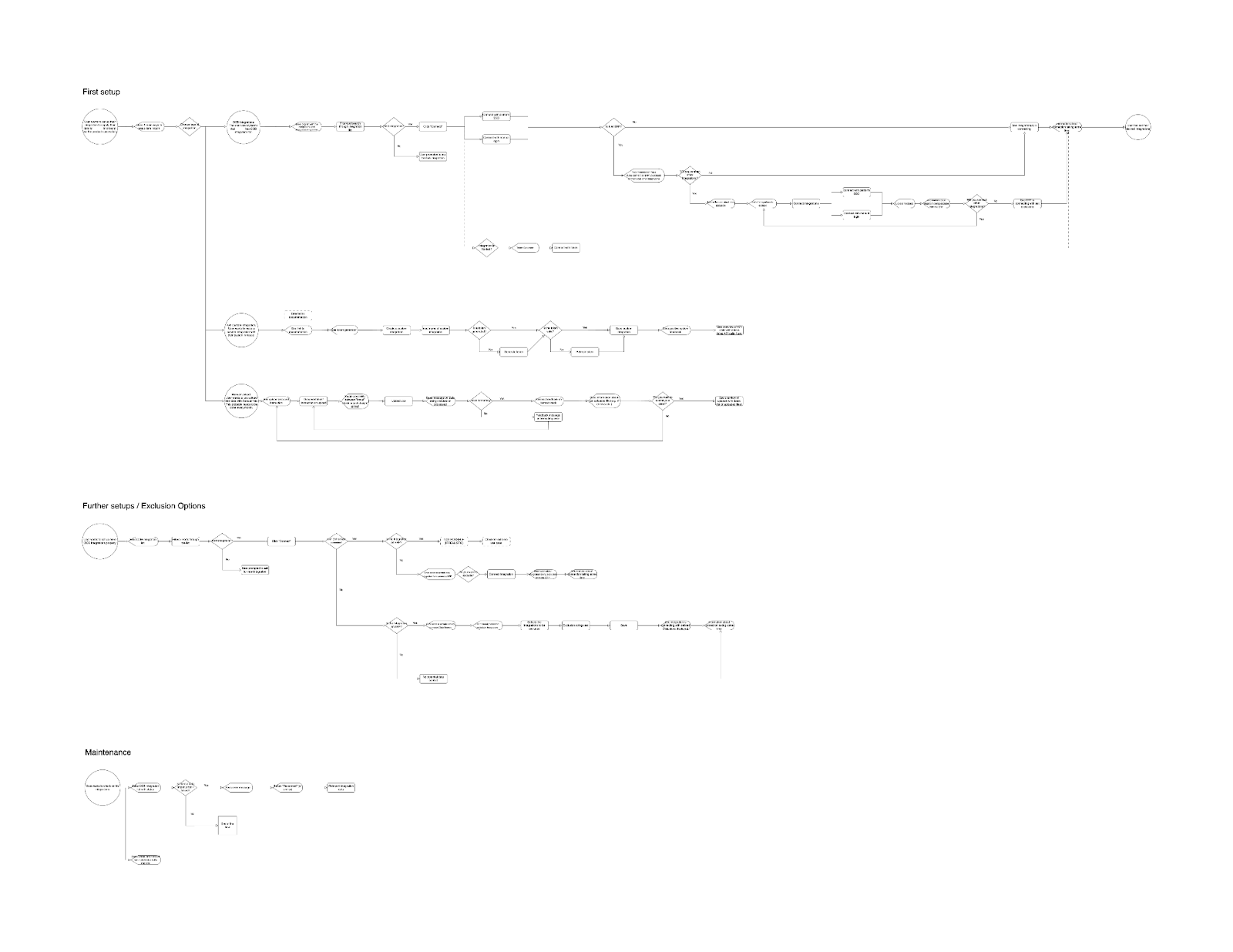
After the project requirements were defined by the PM, I started defining user flows for the different user stories. The ingestion process is complex and composed of multiple potential flows. The most important one is the setup. The product is very "setup" heavy, as it is critical to setup all the data sources properly first for the good function of the product. There are also different levels of complexity and requirements for each different system integration, and all these cases and options need to be carefully considered to create a solution that lets the user setup any kind of configuration easily, while taking into account all those different setup complexities.
Terminology clarification & Translations
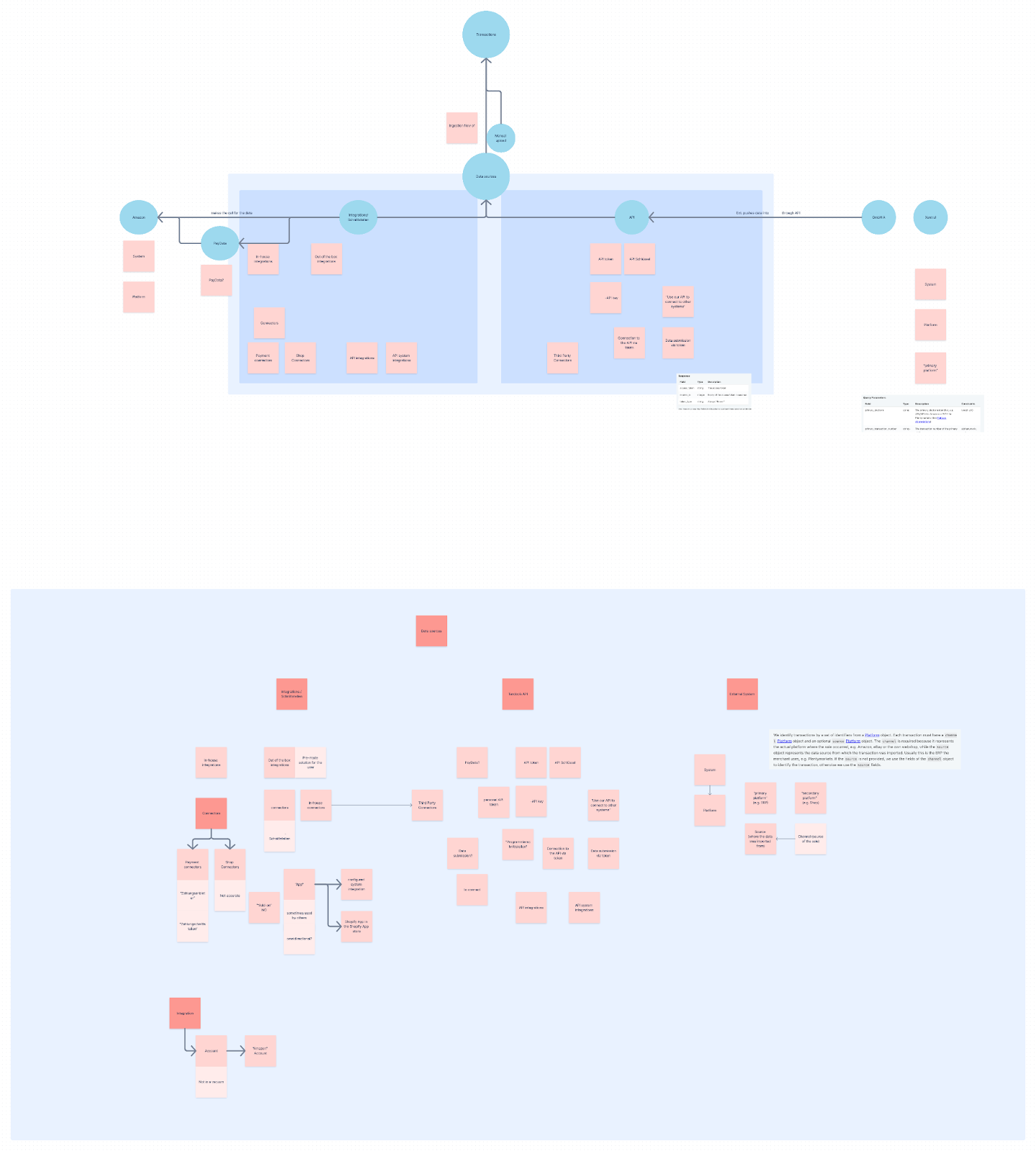
In order to ensure clear collaboration during the project and clear communication with engineers and stakeholders, I mapped out the terms that were used to discuss the topic. A lot of terms were used interchangeably (integrations, connectors, API, systems, data source etc.) and causing confusion between stakeholders. This work also helped with the early copy work of this project by mapping what terminologies are better for what types of user personas and to decide what copy should make it to the front-end and to our users.
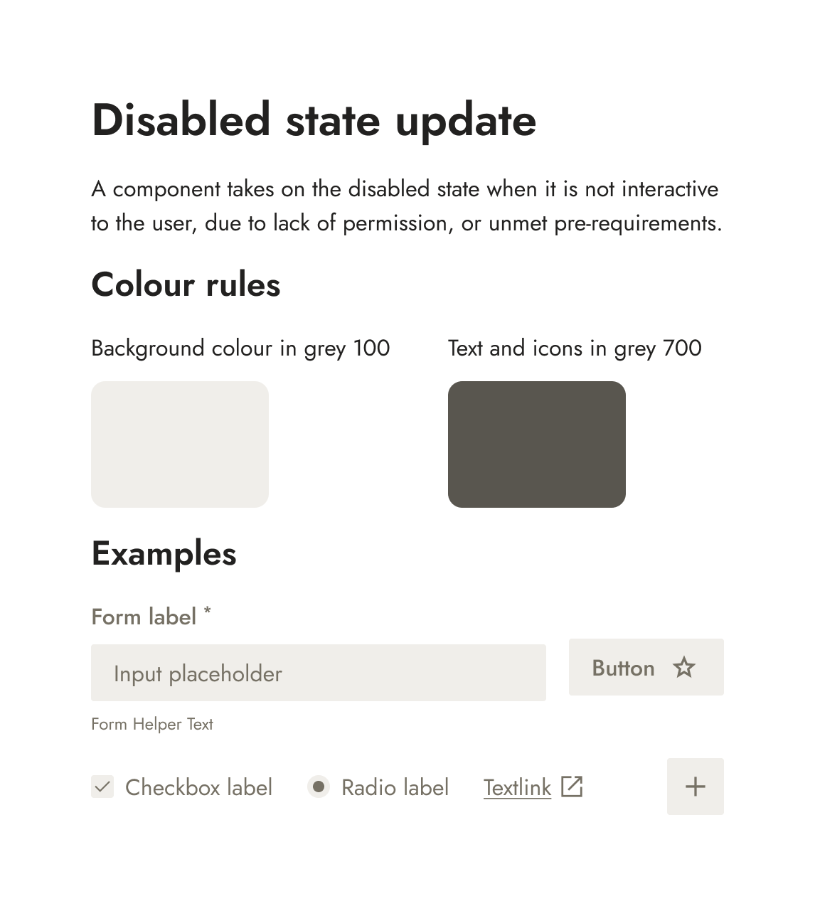
Disabled state update
After some user feedback about the styling of our disabled buttons, I designed and oversaw the implementation of a rework of the disabled states for our Design System.
Background
Users and Customer Support colleagues reported issues with disabled buttons, that it was too prominent and was confusing users.

The problem
The customer feedback was that the dark-grey colour for our disabled states was too prominent and easily confused user.

Indeed, our primary button, even disabled, was very visually strong and would distract, despite its disabled state, from other action (like secondary buttons) that the user could still perform. We want the user to focus on what they can do and what they can interact with in the UI, instead of calling their attention to what they cannot interact with. The secondary button also brought issues, with its grey outline not differentiated enough from its “active” state counterpart.
Having all those differently styled disabled states also didn’t contribute to a clear visual pattern for the user to get used to in our UI.
The goal
Create a clear, consistent and recognizable pattern for the disabled stateDefining an appropriate styling for the disabled state that clearly communicates its state without distracting the users from other actionsDesign a solution that can be systematically deployed for our Design System
Designing the systematic solution
After some initial experimentation and ideas, I settled on a simple yet effective solution. Using a light grey for component background color and a darker grey for texts, icons and interactive elements. This makes the components less visually prevalent, so that the user can focus on what they really need to perform on each page, as well as giving a globally consistent behaviour so that users can easily recognize disabled components throughout the product.
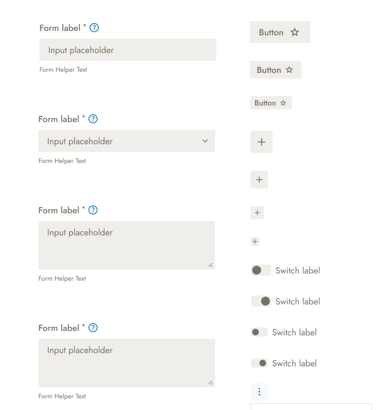
My solution was thoroughly tested for every single interactive component of the library, as well as for all relevant variants and possible use cases (e.g. checked and unchecked checkboxes etc.).
Delivery
Once the solution was devised, thoroughly tested and validated by the Design Lead, I created a visual card to inform all relevant stakeholders and to be shared in product and tech channels.
I also discussed the changes with the Engineering Manager responsible for the Design System so that the changes could be ticketed and picked up in the next sprint.
Conclusion
The final solution is simple yet perfect solution that works for all components of the company’s design system to provide a consistent visual language throughout the product as well as helping focus the users visually away from disabled components and achieve what they’re looking for in the product.
